Data visualization is a powerful tool used to simplify complex information and reveal hidden insights. However, when done poorly, it can lead to bad data visualization examples that mislead audiences and distort reality.
In this comprehensive guide, we explore the pitfalls of bad visualization, share real life examples of bad data visualization, and offer strategies for designing visuals that truly inform.
Throughout this article, you will find numerous bad data visualization examples—from overlapping pie charts to distorted line graphs—that illustrate the most common mistakes.
Our goal is to help you understand these bad examples of data visualization and improve your own data communication techniques.
Table Of Contents 👉
- Understanding the Role of Data Visualization
- Anatomy of a Bad Data Visualization
- Unique And Real Life Bad Data Visualization Examples
- Poor Color Usage in Maps
- Confusing Scale
- The Lines are Lying
- Misleading Y-Axis
- Flipped Y-Axis
- Proportionality Issues
- Incorrect Chart Type
- Illogical Timeline
- Overloaded Information
- Ineffective Legend and Color Choices
- Another Example Of Wrong Chart Type
- Tables Without Context
- Contextual Misrepresentation
- Overly Complex Data
- Needlessly 3D Charts
- Ineffective Pie and Donut Charts
- Lack of a Clear Narrative
- Charts Within Charts
- Scatter Plots That Lack Clarity
- Misleading Scale
- Failed Connections
- Real-World Implications In Various Fields
- Strategies to Avoid Bad Data Visualization
- Integrating Lessons from Bad Examples Of Data Visualization
- Practical Tips and Checklists
- Conclusion
Understanding the Role of Data Visualization
Data visualization turns raw data into visual representations—charts, graphs, infographics—that simplify information for quicker understanding.
The aim is to present data accurately, but bad data visualization examples show that poor design choices can easily lead to misinterpretation.
When visuals are confusing or misleading, they become an example of bad data visualization that can have real-world consequences, from misguided business decisions to public policy errors.
Historically, visual data communication has evolved from simple maps and charts to intricate digital dashboards. Today, almost anyone can generate a graph with modern tools.
Unfortunately, this ease of creation sometimes leads to data visualization bad examples that overcomplicate or misrepresent data. This article examines these bad data visualization examples and provides guidance on how to avoid such pitfalls.
The impact of bad examples of data visualization is significant. When data is misrepresented, it can distort public opinion, affect investment decisions, and even influence policy.
By understanding these bad data visualization examples, you can appreciate the importance of clear, accurate visual communication and learn to avoid common mistakes.
Anatomy of a Bad Data Visualization
At its core, a bad data visualization example misleads by distorting, omitting, or overcomplicating the information presented.
These errors might be unintentional or deliberately used to sway opinions. Whether it’s an example of bad data visualization or a real life example of bad data visualization, the result is the same: the audience ends up with a skewed interpretation of the underlying data.
Common Characteristics
Many bad data visualization examples share common traits:
- Incorrect Chart Selection: Not every dataset is best represented by a pie chart or bar graph.
- Distorted Axes: Manipulated axes, like truncated Y-axes, create false impressions.
- Cluttered Layouts: Overloading visuals with excessive details or colors diminishes clarity.
- Misuse of 3D Effects: Adding unnecessary 3D elements can skew data interpretation.
- Inadequate Labeling: Without proper labels and legends, a chart’s purpose becomes lost.
Each of these below examples is a prime bad data visualization example with data that we’ll explore in detail below.
Unique And Real Life Bad Data Visualization Examples
Poor Color Usage in Maps
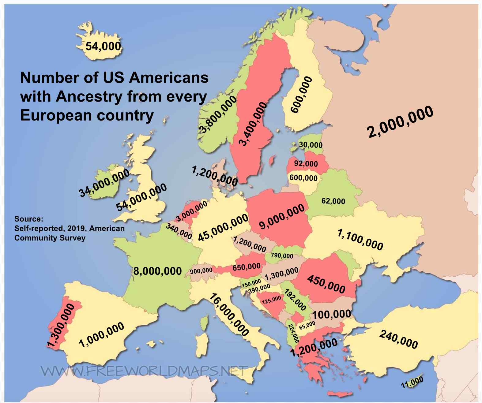
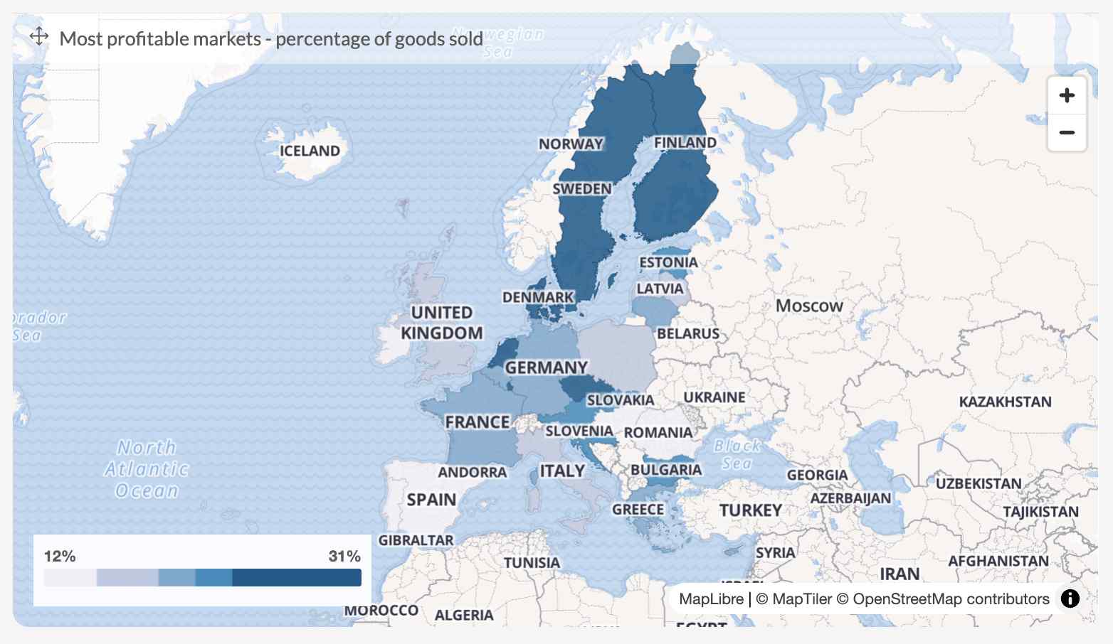
The above image is of a map that illustrates the ancestry of Americans from different European countries. The colors used are inconsistent, making it hard to understand the data.
For instance, the same color might represent multiple values, leading to confusion. A better map would use a gradient where lighter colors indicate lower values and darker colors signify higher values, enhancing clarity.
Posts You May Like
Confusing Scale
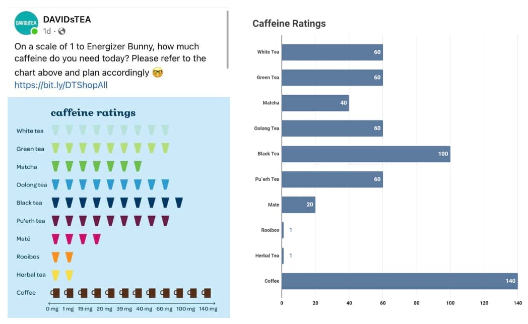
An infographic comparing caffeine levels in tea and coffee fails due to an unintuitive scale on the y-axis. It jumps from 0 mg to 19 mg, making it hard to understand.
This is a classic example of bad data visualization where viewers can’t easily interpret the information, leading to confusion about the caffeine content in different beverages.
The Lines are Lying
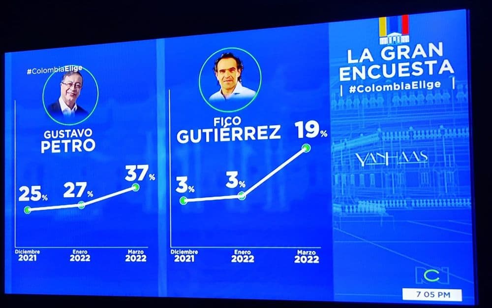
This graph compares the popularity of two leaders but uses different scales on the vertical axes. This makes it appear that one leader is more popular than the other, which is misleading. This is another example of bad data visualization.
Misleading Y-Axis

In a bar chart comparing two political candidates, the Y-axis scale is manipulated. Although the candidates have similar percentages (46% vs. 47%), the chart makes it appear as if one candidate is significantly ahead due to the misleading scale. This is a classic example of bad data visualization, as it distorts reality and can mislead viewers.
Flipped Y-Axis
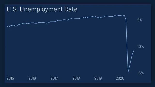
A graph showing unemployment rates flips the y-axis, making it seem like unemployment dropped from 5% to 15%. This is a confusing representation and a clear bad example of data visualization as it distorts the actual trend, misleading viewers about the economic situation.
Proportionality Issues
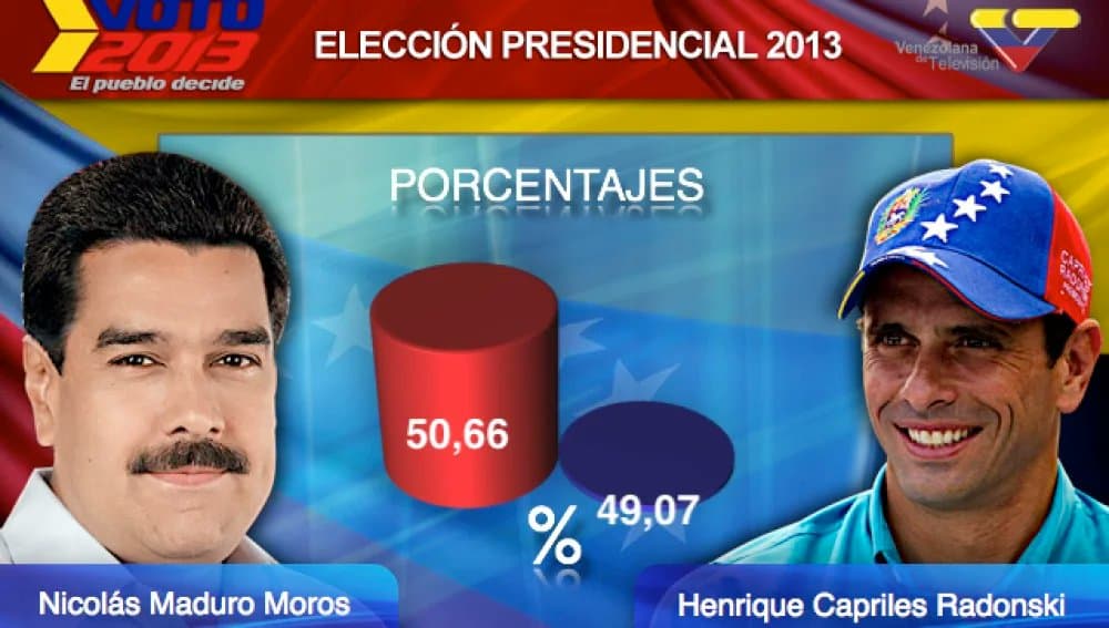
This visualization shows voting percentages in Venezuelan elections but exaggerates the difference in vote percentages with misleading bar sizes. This is a bad data visualization example that distorts the data.
Incorrect Chart Type
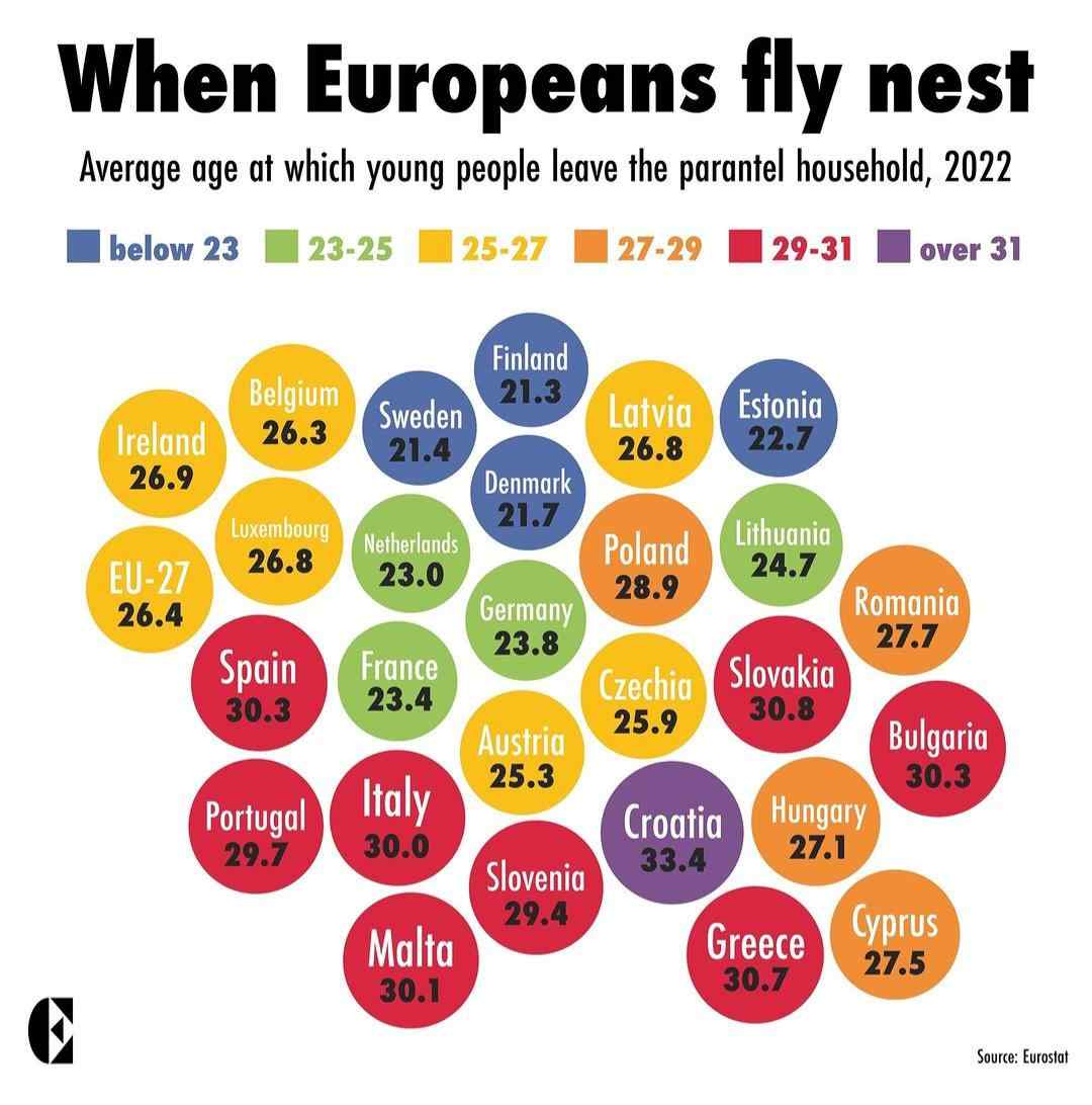
A graphic illustrating the ages at which young people leave home across Europe opts for abstract shapes instead of a clear line chart or map.
This approach confuses rather than informs, making it a poor example of data visualization as it fails to effectively communicate meaningful insights.
Illogical Timeline

A chart detailing copper prices during a crisis presents dates in a confusing manner, mixing day-by-day data with gaps of weeks.
This inconsistency is a bad data visualization example because it fails to provide a clear timeline, leaving viewers puzzled about the actual price changes.
Overloaded Information

This graphic is cluttered with too much information, making it hard for viewers to extract meaningful insights. It’s a classic example of bad data visualization because it overwhelms the audience instead of clarifying the information.
Ineffective Legend and Color Choices
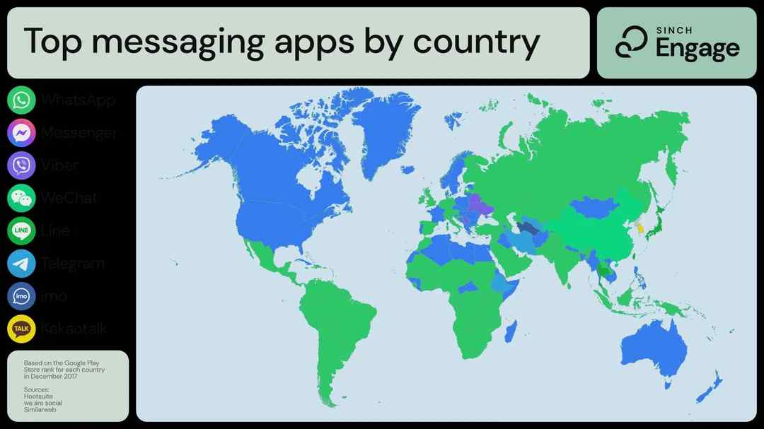
A chart displaying the most popular messaging apps by country suffers from adjacent colors that are too similar.
This makes it difficult to differentiate between the data points. The legend is also poorly designed, leading to misinterpretation. This is another real-life example of bad data visualization where clarity is sacrificed for aesthetics.
Another Example Of Wrong Chart Type

In this bad example of data visualization, the chart uses too many crisscrossing lines, making it hard to identify trends. Choosing the wrong chart type can distort your message and confuse your audience.
Always select a chart type that clearly presents the data. Experiment with different types to see which one conveys the information best.
Tables Without Context

The table does not offer meaningful insights, confusing viewers regarding the significance of the numbers. A better approach would be to provide context, such as averages or comparisons, to give the numbers meaning. For example, by indicating that $1,580 is above the average, viewers can better understand its significance and appreciate the valuable context.
Contextual Misrepresentation

A bar chart showing the number of serial killers per country presents absolute numbers without considering population size.
For instance, comparing the US (over 300 million people) with the UK (67 million) creates a skewed perspective. This is a clear example of bad data visualization, as it lacks context and can lead to incorrect conclusions.
Overly Complex Data

This example of bad data visualization overwhelms viewers with too much information at once. Without interactive features, the clutter makes it difficult to extract key insights. Use analytics tools with interactive features to allow users to explore data without feeling overwhelmed.
Needlessly 3D Charts
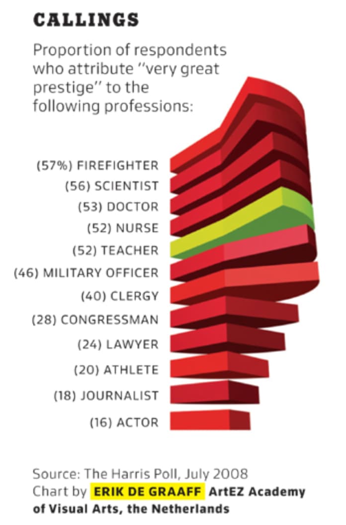
This chart misrepresents the data by introducing unnecessary dimensions, which complicates the interpretation of the actual values. A better approach would be to use 2D charts for greater clarity. Simple bar or line charts can effectively convey the same information without confusion.
Posts You May Like
Ineffective Pie and Donut Charts
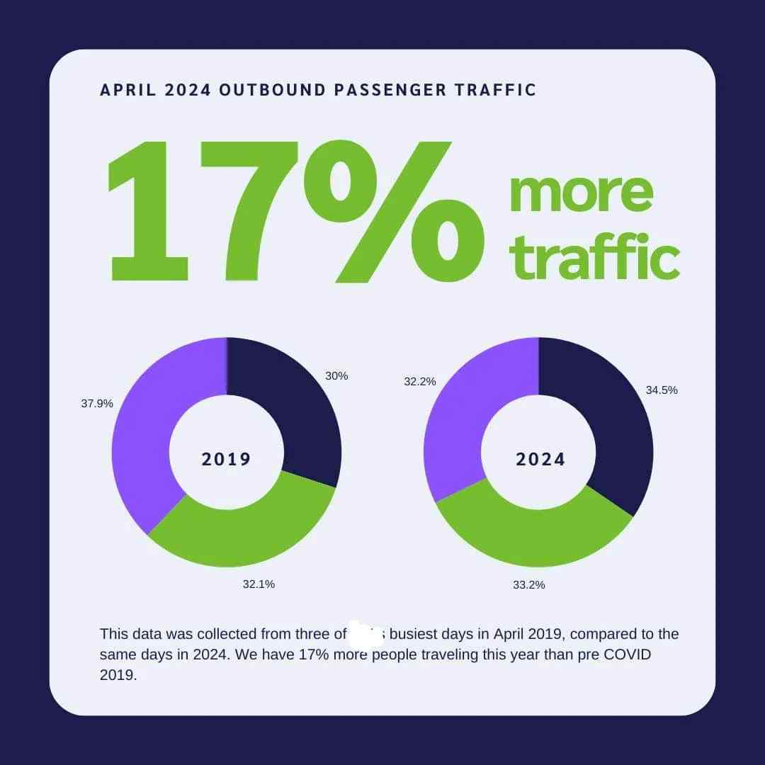
Pie and donut charts often complicate data interpretation. For instance, a donut chart comparing airport passengers from different years can confuse viewers due to its design. Instead of simplifying information, it makes it more complex, demonstrating why these are bad examples of data visualization.
Lack of a Clear Narrative

In this bad chart example, there’s no clear message or story. Viewers are left confused about what the data means, making it feel pointless. Start with a key message and organize your visuals to guide the audience through the data logically.
Charts Within Charts
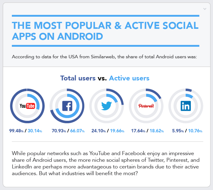
It took a while to understand what was going on. The main issue is that they present a total user metric as a percentage, which makes it unclear what the data represents.
For instance, the statement suggests that 99.48% of YouTube mobile app users in the U.S. are on Android, which seems implausible given Apple’s significant market share.
Additionally, the inner circle showing active users raises questions. It’s unclear if active users are part of the total users, leading to potential misinterpretation of the data.
Avoid using a pie chart within another pie chart. They should have started fresh and used clearer metrics to present their data.
Scatter Plots That Lack Clarity

A scatter plot comparing various digital consulting services fails to provide useful insights. When all points are labeled as leaders, it becomes impossible to distinguish between them.
This is yet another bad data visualization example, highlighting the importance of choosing the right visualization type for effective communication.
Misleading Scale

In this bad data visualization example, the size of images misleads viewers about the data they represent, creating incorrect conclusions. Keep scales consistent and ensure all visual elements serve a clear purpose in conveying data.
Failed Connections

While not as egregious as the first example, this graphic has several formatting issues. The data values and labels are separated from the chart, making it hard to interpret.
There’s no clear legend, and the data labels are mixed in with a paragraph of text. This separation makes it difficult for readers to connect the data with the visualization.
Moreover, the color coding is inconsistent. For example, there are more slices in the pie chart than there are values to match them, leading to confusion.
They should have included a legend and clear labels, ensuring that data values and labels are not separated. Consistency in color coding is also crucial.
Real-World Implications In Various Fields
In business, even a single bad data visualization example can lead to incorrect interpretations of performance, exaggerated trends, or investor miscommunication.
A truncated Y-axis in a bar chart might falsely imply rapid growth, while a cluttered design can hide important details about market trends. These data visualization bad examples highlight the necessity for accuracy and clarity in reporting.
Misleading visuals in healthcare or policy presentations can have dire consequences. Imagine a real life example of bad data visualization where a chart showing disease trends is mis-scaled—this could lead to panic or misplaced public health responses.
Recognizing bad examples of data visualization in these fields is critical for ensuring public safety and informed policy-making.
Journalists rely on visuals to tell impactful stories. Examples of bad data visualization in media can undermine a news story’s credibility, leading audiences to doubt even the most straightforward data. It is essential to scrutinize every visual for clarity, accuracy, and ethical presentation.
Strategies to Avoid Bad Data Visualization
Choosing the Right Visual
To avoid creating bad data visualization examples, start with the right chart type:
- Bar Charts: Ideal for category comparisons.
- Line Graphs: Best for trend analysis over time.
- Scatter Plots: Useful for displaying correlations.
- Pie Charts: Only for simple proportional data.
Maintaining Accurate Scales
Always use a zero baseline when possible and maintain even intervals. This practice prevents data visualization bad examples like truncated axes, which can mislead viewers by exaggerating differences.
Simplifying Designs
Keep visuals uncluttered. Limit colors and decorative elements, and highlight only the key data points. Simplified visuals are less likely to become bad data visualization examples that confuse rather than inform.
Clear Annotations and Labels
Ensure every graph includes descriptive titles, legends, and source information. This attention to detail is crucial for avoiding examples of bad data visualization that leave the audience guessing about the context and meaning of the data.
Testing for Accessibility
Design for all viewers by using accessible color palettes and readable fonts. Making your visuals accessible is a key defense against real life examples of bad data visualization that can alienate parts of your audience.
Integrating Lessons from Bad Examples Of Data Visualization
Every one of the above bad data visualization examples teaches us a critical lesson about clarity, precision, and context in data presentation.
Whether it’s a misaligned chart or an overly animated graphic, these bad examples of data visualization reveal common pitfalls that you should avoid. For instance, always verify that your axes start at zero unless a deviation is justified.
Ensure that each visual element—color, layout, labeling—serves a clear purpose. These practices help steer clear of data visualization bad examples that distort the underlying data.
Furthermore, using bad data visualization examples from multiple reputable sources reinforces the importance of accuracy in communication.
By examining these real life examples of bad data visualization, you can better understand how to refine your own visualizations for clarity and effectiveness.
Practical Tips and Checklists
To wrap up, here’s a concise checklist that you can use every time you create a visualization:
Purpose and Audience
- What is the key message?
- Who is the target audience?
- What insights should the viewer take away?
Data Preparation
- Is your data accurate and reliable?
- Have you cleaned and organized your data?
- Are outliers and missing values accounted for?
Design and Layout
- Choose the appropriate chart type.
- Ensure the axes are correctly scaled.
- Use a clear, uncluttered layout.
- Apply a consistent color palette.
Annotations and Context
- Add descriptive titles and labels.
- Include legends if multiple colors or symbols are used.
- Provide source references and contextual notes.
Testing and Feedback
- Test your visualization on different devices.
- Gather feedback from potential users.
- Revise based on constructive criticism.
Ethical Considerations
- Double-check that your visualization does not mislead.
- Ensure that your design choices are transparent.
- Aim for inclusivity and accessibility.
Conclusion
The journey through bad data visualization examples demonstrates that what might appear as a minor design flaw can have major implications.
From overlapping pie charts to misleading stacked bar graphs, each example of bad data visualization reminds us that clarity and honesty in data communication are paramount.
By learning from these bad data visualization examples- unique cases detailed above—you can steer clear of common pitfalls and produce visuals that truly enlighten your audience.
Remember, every time you create a visualization, consider the lessons from these bad examples of data visualization. Whether you’re preparing a business report, a public policy presentation, or a journalistic piece, ensure your charts and graphs reflect accurate, accessible data.
With careful planning, testing, and adherence to best practices, you can transform potential data visualization bad examples into powerful tools for understanding and decision-making.
As you move forward, let the insights from these bad data visualization examples guide your design process. Focus on simplicity, accurate scaling, and clear communication. In doing so, you’ll not only avoid becoming another example of bad data visualization—you’ll set a higher standard for how data is shared and interpreted.
